Card
Get started with a large variety of Tailwind CSS card examples for your web project
Use these responsive card components to show data entries and information to your users in multiple forms and contexts such as for your blog, application, user profiles, and more.
Set up
Import Card in the script tag.
<script>
  import { Card } from "flowbite-svelte";
</script>
Default card
Use the following simple card component with a title and description.
Notice the href prop set, as that card is one big <a/> element.
<Card href="/cards">
  <h5 class="mb-2 text-2xl font-bold tracking-tight text-gray-900 dark:text-white">Noteworthy technology acquisitions 2021</h5>
  <p class="font-normal text-gray-700 dark:text-gray-400 leading-tight">
    Here are the biggest enterprise technology acquisitions of 2021 so far, in reverse chronological order.
  </p>
</Card>
Card with action button
Use the following example of a card element if you also want to have an action button.
Noteworthy technology acquisitions 2021
Here are the biggest enterprise technology acquisitions of 2021 so far, in reverse chronological order.
<Card>
  <h5 class="mb-2 text-2xl font-bold tracking-tight text-gray-900 dark:text-white">Noteworthy technology acquisitions 2021</h5>
  <p class="mb-3 font-normal text-gray-700 dark:text-gray-400 leading-tight">
    Here are the biggest enterprise technology acquisitions of 2021 so far, in reverse chronological order.
  </p>
  <Button class="w-fit">
    Read more <ArrowRight class="w-5 h-5 ml-2"/>
  </Button>
</Card>
Card with link
This example can be used to show a CTA as a link instead of a button inside the card.
Need a help in Claim?
Go to this step by step guideline process on how to certify for your weekly benefits:
See our guideline<Card>
<Gift variation="solid" class="mb-2 w-12 h-12 text-gray-500 dark:text-gray-400"/>
<a href="/">
<h5 class="mb-2 text-2xl font-semibold tracking-tight text-gray-900 dark:text-white">Need a help in Claim?</h5>
</a>
<p class="mb-3 font-normal text-gray-500 dark:text-gray-400">Go to this step by step guideline process on how to certify for your weekly benefits:</p>
<a href="/" class="inline-flex items-center text-blue-600 hover:underline">
See our guideline
<ExternalLink class="ml-2 w-5 h-5"/>
</a>
</Card>Card with image
User reverse=true to reverse the position of an image.
You can use the following example of a card element with an image for blog posts, user cards, and many more.

Noteworthy technology acquisitions 2021
Here are the biggest enterprise technology acquisitions of 2021 so far, in reverse chronological order.
<Card img="/images/image-1.jpeg" reverse={true}>
  <h5 class="mb-2 text-2xl font-bold tracking-tight text-gray-900 dark:text-white">Noteworthy technology acquisitions 2021</h5>
  <p class="mb-3 font-normal text-gray-700 dark:text-gray-400 leading-tight">
    Here are the biggest enterprise technology acquisitions of 2021 so far, in reverse chronological order.
  </p>
  <Button>
    Read more <ArrowRight class="w-5 h-5 ml-2"/>
  </Button>
</Card>
Horizontal card
If you want to spice up your cards you can use the following card which has its child elements aligned horizontally.
<Card img="/images/image-1.jpeg" href="/" horizontal reverse={true}>
  <h5 class="mb-2 text-2xl font-bold tracking-tight text-gray-900 dark:text-white">Noteworthy technology acquisitions 2021</h5>
  <p class="mb-3 font-normal text-gray-700 dark:text-gray-400 leading-tight">
    Here are the biggest enterprise technology acquisitions of 2021 so far, in reverse chronological order.
  </p>
</Card>
User profile card
Use this user profile card example if you want to show a dropdown menu and buttons to enable multiple actions from your user.
- Edit
- Export data
- Delete

Bonnie Green
Visual Designer<Card padding='sm'>
<div class="flex justify-end">
<Dropdown class="w-44">
<CloseButton slot="trigger" class="text-gray-500 dark:text-gray-400">
<DotsHorizontal class="w-6 h-6"/>
</CloseButton>
<DropdownItem>Edit</DropdownItem>
<DropdownItem>Export data</DropdownItem>
<DropdownItem>Delete</DropdownItem>
</Dropdown>
</div>
<div class="flex flex-col items-center pb-4">
<Avatar size="lg" src="/images/profile-picture-3.webp" />
<h5 class="mb-1 text-xl font-medium text-gray-900 dark:text-white">Bonnie Green</h5>
<span class="text-sm text-gray-500 dark:text-gray-400">Visual Designer</span>
<div class="flex mt-4 space-x-3 lg:mt-6">
<Button>Add friend</Button>
<Button color="light" class="dark:text-white">Message</Button>
</div>
</div>
</Card>Card with form inputs
Use this card example where you can add form input elements that can be used for authentication actions or any other context where you need to receive information from your users.
<Card>
	<form class="flex flex-col space-y-6" action="/">
		<h3 class="text-xl font-medium text-gray-900 dark:text-white p-0">Sign in to our platform</h3>
		<Label class="space-y-2">
			<span>Email</span>
			<Input type="email" name="email" placeholder="name@company.com" required />
		</Label>
		<Label class="space-y-2">
			<span>Your password</span>
			<Input type="password" name="password" placeholder="•••••" required />
		</Label>
		<div class="flex items-start">
			<Checkbox>Remember me</Checkbox>
			<a href="/" class="ml-auto text-sm text-blue-700 hover:underline dark:text-blue-500">Lost password?</a>
		</div>
		<Button type="submit" class="w-full1">Login to your account</Button>
			<div class="text-sm font-medium text-gray-500 dark:text-gray-300">
				Not registered? <a href="/" class="text-blue-700 hover:underline dark:text-blue-500">Create account</a>
			</div>
	</form>
</Card>
E-commerce card
Use this card for your e-commerce websites and show information about the products and enable actions such as adding a review and adding the product to the cart.
<Card padding="sm">
	<a href="/">
		<img class="p-3" src="images/product-1.webp" alt="product 1" />
	</a>
	<a href="/">
		<h3 class='text-xl font-semibold tracking-tight text-gray-900 dark:text-white'>
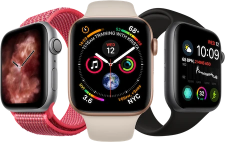
			Apple Watch Series 7 GPS, Aluminium Case, Starlight Sport
		</h3>
	</a>
  <Rating rating=4>
    <Badge slot="text">4</Badge>
  </Rating>
	<div class="flex justify-between items-center">
		<span class="text-3xl font-bold text-gray-900 dark:text-white">$543</span>
		<Button href="/">Buy now</Button>
	</div>
</Card>
Call to action card
Use this CTA card example to encourage your users to visit a certain page such as downloading the iOS or Android application for your project.
Work fast from anywhere
Stay up to date and move work forward with Flowbite on iOS & Android. Download the app today.
<Card class="text-center" size="lg" padding='xl'>
  <h5 class="mb-2 text-3xl font-bold text-gray-900 dark:text-white">Work fast from anywhere</h5>
  <p class="mb-5 text-base text-gray-500 sm:text-lg dark:text-gray-400">
    Stay up to date and move work forward with Flowbite on iOS & Android. Download the app today.
  </p>
  <div class="justify-center items-center space-y-4 sm:flex sm:space-y-0 sm:space-x-4">
    <Button>Download it</Button>
    <Button>Get it on</Button>
  </div>
</Card>
Card with list
Use this card example if you want to show a list of data:
Latest Customers
View all Neil Simsemail@windster.com$320
 Bonnie Greenemail@windster.com$3467
 Michael Goughemail@windster.com$67
<script>
  let list = [
    { img: { src: "/images/profile-picture-1.webp", alt: "Neil Sims",},
      name: "Neil Sims", email: "email@windster.com", value: "$320"
    },
    { img: { src: "/images/profile-picture-2.webp", alt: "Bonnie Green" },
      name: "Bonnie Green", email: "email@windster.com", value: "$3467"
    },
    { img: { src: "/images/profile-picture-3.webp", alt: "Michael Gough" },
      name: "Michael Gough", email: "email@windster.com", value: "$67"
    },
  ];
</script>

<Card padding="xl">
  <div class="flex justify-between items-center mb-4">
      <h5 class="text-xl font-bold leading-none text-gray-900 dark:text-white">
        Latest Customers
      </h5>
      <a href="#" class="text-sm font-medium text-blue-600 hover:underline dark:text-blue-500">
          View all
      </a>
  </div>
  <List items={list} let:item class="border-0 dark:!bg-transparent">
    <div class="flex items-center space-x-4">
      <Avatar src={item.img.src} alt={item.img.alt}/>
      <div class="flex-1 space-y-1 font-medium dark:text-white">
        <div>{item.name}</div>
        <div class="text-sm text-gray-500 dark:text-gray-400">{item.email}</div>
      </div>
      <div class="inline-flex items-center text-xl font-semibold text-gray-900 dark:text-white">
          {item.value}
      </div>
    </div>
  </List>
</Card>
Pricing card
Show detailed information to potential customers about your product’s pricing plan, list of features, and a purchase button.
Standard plan
- 2 team members
- 20GB Cloud storage
- Integration help
- Sketch Files
- API Access
- Complete documentation
- 24×7 phone & email support
<Card padding="xl">
  <h5 class="mb-4 text-xl font-medium text-gray-500 dark:text-gray-400">Standard plan</h5>
  <div class="flex items-baseline text-gray-900 dark:text-white">
      <span class="text-3xl font-semibold">$</span>
      <span class="text-5xl font-extrabold tracking-tight">49</span>
      <span class="ml-1 text-xl font-normal text-gray-500 dark:text-gray-400">/month</span>
  </div>
  <!-- List -->
  <ul role="list" class="my-7 space-y-4">
      <li class="flex space-x-2">
          <CheckCircle variation="solid" class="text-blue-600 dark:text-blue-500" />
          <span class="text-base font-normal leading-tight text-gray-500 dark:text-gray-400">2 team members</span>
      </li>
      <li class="flex space-x-2">
          <CheckCircle variation="solid" class="text-blue-600 dark:text-blue-500" />
          <span class="text-base font-normal leading-tight text-gray-500 dark:text-gray-400">20GB Cloud storage</span>
      </li>
      <li class="flex space-x-2">
          <CheckCircle variation="solid" class="text-blue-600 dark:text-blue-500" />
          <span class="text-base font-normal leading-tight text-gray-500 dark:text-gray-400">Integration help</span>
      </li>
      <li class="flex space-x-2 line-through decoration-gray-500">
          <CheckCircle variation="solid" class="text-gray-400 dark:text-gray-500" />
          <span class="text-base font-normal leading-tight text-gray-500">Sketch Files</span>
      </li>
      <li class="flex space-x-2 line-through decoration-gray-500">
          <CheckCircle variation="solid" class="text-gray-400 dark:text-gray-500" />
          <span class="text-base font-normal leading-tight text-gray-500">API Access</span>
      </li>
      <li class="flex space-x-2 line-through decoration-gray-500">
          <CheckCircle variation="solid" class="text-gray-400 dark:text-gray-500" />
          <span class="text-base font-normal leading-tight text-gray-500">Complete documentation</span>
      </li>
      <li class="flex space-x-2 line-through decoration-gray-500">
          <CheckCircle variation="solid" class="text-gray-400 dark:text-gray-500" />
          <span class="text-base font-normal leading-tight text-gray-500">24×7 phone & email support</span>
      </li>
  </ul>
  <Button class="w-full">Choose plan</Button>
</Card>
Testimonial card
Use this example to split cards into multiple sections such as for testimonials or reviews.
Very easy this was to integrate
If you care for your time, I hands down would go with this."

Solid foundation for any project
Designing with Figma components that can be easily translated to the utility classes of Tailwind CSS is a huge timesaver!"

Mindblowing workflow
Aesthetically, the well designed components are beautiful and will undoubtedly level up your next application."

Efficient Collaborating
You have many examples that can be used to create a fast prototype for your team."

<Card padding="none" size="xl" class="grid md:grid-cols-2">
  <figure class="flex flex-col justify-center items-center p-8 text-center bg-white rounded-t-lg border-b border-gray-200 md:rounded-t-none md:rounded-tl-lg md:border-r dark:bg-gray-800 dark:border-gray-700">
  <blockquote class="mx-auto mb-4 max-w-2xl text-gray-500 dark:text-gray-400">
    <h3 class="p-0 text-lg font-semibold text-gray-900 dark:text-white">Very easy this was to integrate</h3>
    <p class="my-4 font-light">If you care for your time, I hands down would go with this."</p>
  </blockquote>
  <figcaption class="flex justify-center items-center space-x-3">
    <img class="w-9 h-9 rounded-full" src="https://flowbite.s3.amazonaws.com/blocks/marketing-ui/avatars/karen-nelson.png" alt="karen profile">
    <div class="space-y-0.5 font-medium dark:text-white text-left">
      <div>Bonnie Green</div>
      <div class="text-sm font-light text-gray-500 dark:text-gray-400">Developer at Open AI</div>
    </div>
  </figcaption>
  </figure>
  <figure class="flex flex-col justify-center items-center p-8 text-center bg-white rounded-tr-lg border-b border-gray-200 dark:bg-gray-800 dark:border-gray-700">
    <blockquote class="mx-auto mb-4 max-w-2xl text-gray-500 dark:text-gray-400">
      <h3 class="p-0 text-lg font-semibold text-gray-900 dark:text-white">Solid foundation for any project</h3>
    <p class="my-4 font-light">Designing with Figma components that can be easily translated to the utility classes of Tailwind CSS is a huge timesaver!"</p>
    </blockquote>
    <figcaption class="flex justify-center items-center space-x-3">
      <img class="w-9 h-9 rounded-full" src="https://flowbite.s3.amazonaws.com/blocks/marketing-ui/avatars/roberta-casas.png" alt="roberta profile">
      <div class="space-y-0.5 font-medium dark:text-white text-left">
        <div>Roberta Casas</div>
        <div class="text-sm font-light text-gray-500 dark:text-gray-400">Lead designer at Dropbox</div>
      </div>
      </figcaption>
  </figure>
  <figure class="flex flex-col justify-center items-center p-8 text-center bg-white rounded-bl-lg border-b border-gray-200 md:border-b-0 md:border-r dark:bg-gray-800 dark:border-gray-700">
    <blockquote class="mx-auto mb-4 max-w-2xl text-gray-500 dark:text-gray-400">
      <h3 class="p-0 text-lg font-semibold text-gray-900 dark:text-white">Mindblowing workflow</h3>
      <p class="my-4 font-light">Aesthetically, the well designed components are beautiful and will undoubtedly level up your next application."</p>
    </blockquote>
    <figcaption class="flex justify-center items-center space-x-3">
      <img class="w-9 h-9 rounded-full" src="https://flowbite.s3.amazonaws.com/blocks/marketing-ui/avatars/jese-leos.png" alt="jese profile">
      <div class="space-y-0.5 font-medium dark:text-white text-left">
        <div>Jese Leos</div>
        <div class="text-sm font-light text-gray-500 dark:text-gray-400">Software Engineer at Facebook</div>
      </div>
    </figcaption>
  </figure>
  <figure class="flex flex-col justify-center items-center p-8 text-center bg-white rounded-b-lg border-gray-200 md:rounded-br-lg dark:bg-gray-800 dark:border-gray-700">
    <blockquote class="mx-auto mb-4 max-w-2xl text-gray-500 dark:text-gray-400">
      <h3 class="p-0 text-lg font-semibold text-gray-900 dark:text-white">Efficient Collaborating</h3>
      <p class="my-4 font-light">You have many examples that can be used to create a fast prototype for your team."</p>
    </blockquote>
    <figcaption class="flex justify-center items-center space-x-3">
      <img class="w-9 h-9 rounded-full" src="https://flowbite.s3.amazonaws.com/blocks/marketing-ui/avatars/joseph-mcfall.png" alt="joseph profile">
      <div class="space-y-0.5 font-medium dark:text-white text-left">
        <div>Joseph McFall</div>
        <div class="text-sm font-light text-gray-500 dark:text-gray-400">CTO at Google</div>
      </div>
      </figcaption>
  </figure>
</Card>
Props
The component has the following props, type, and default values. See types page for type information.
Card
| Name | Type | Default |
|---|---|---|
| href | string | undefined |
| horizontal | boolean | false |
| reverse | boolean | false |
| img | string | undefined |
| padding | 'none' | 'sm' | 'md' | 'lg' | 'lg' |
| size | 'xs' | 'sm' | 'md' | 'lg' | 'xl' | 'sm' |
Slots
Card
| Name | Description |
|---|---|
| default | For a button label. |
